From chaos to clarity
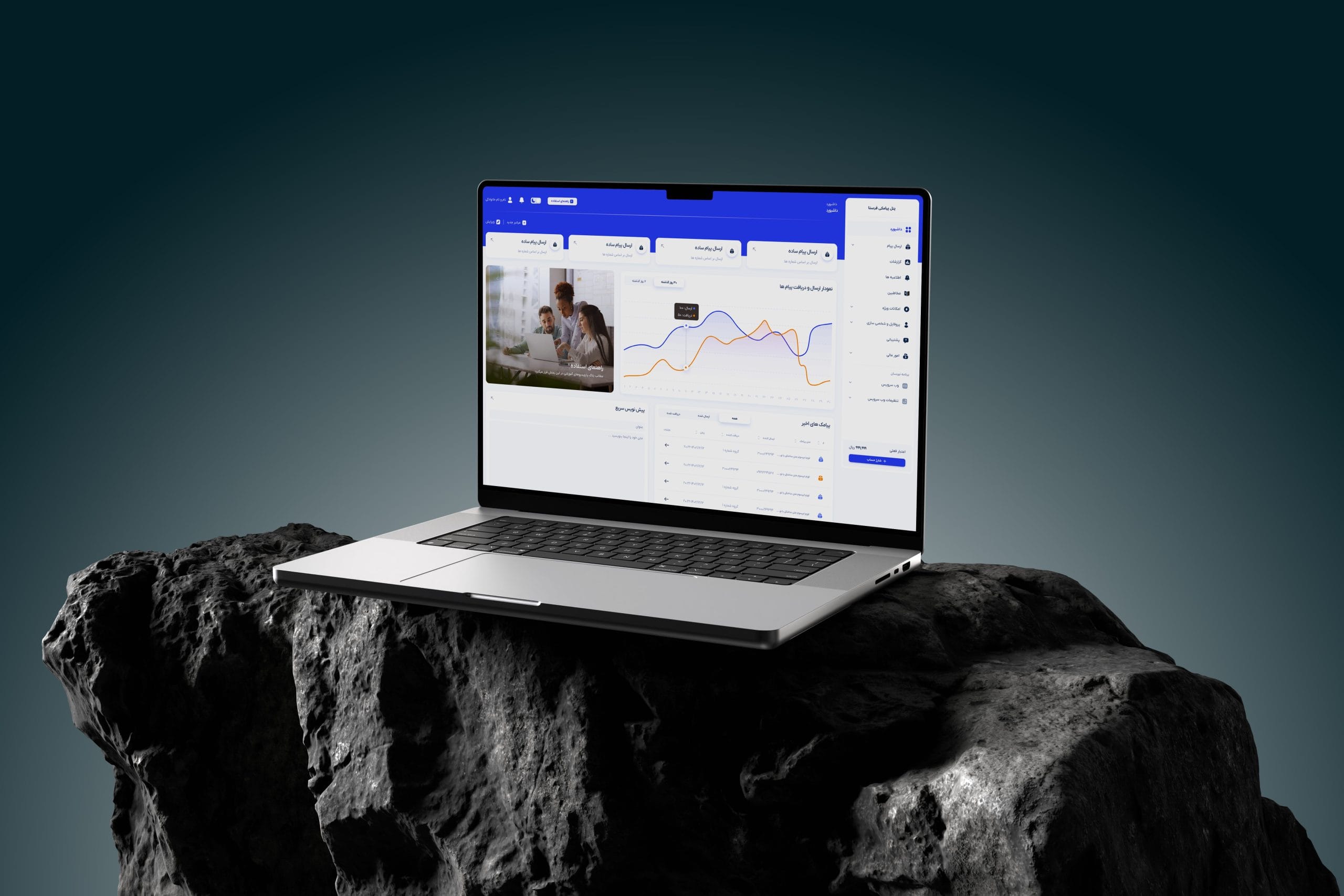
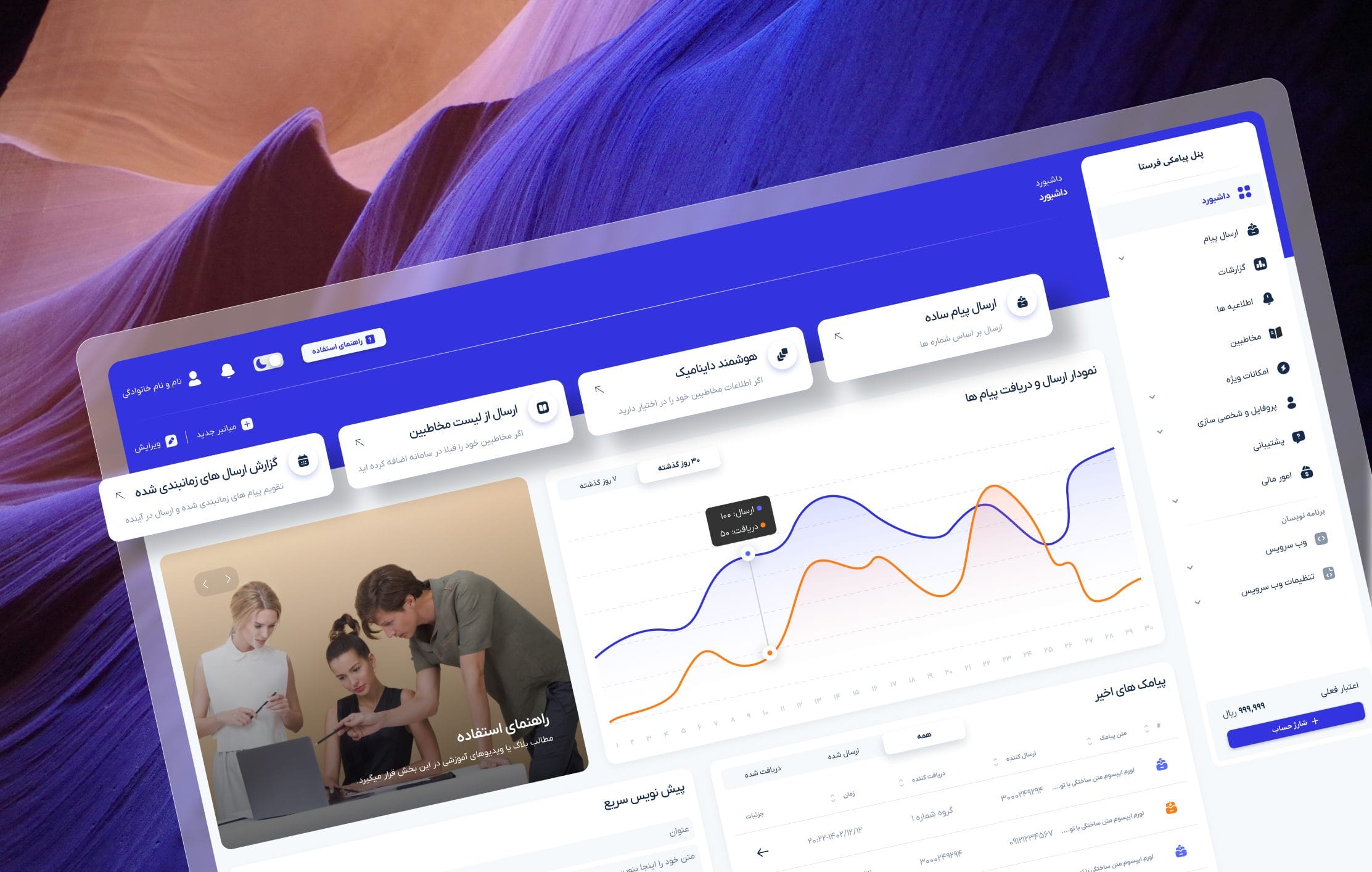
The original dashboard had grown organically for years. Every new feature added more confusion. Users couldn't find what already existed because the interface buried it.
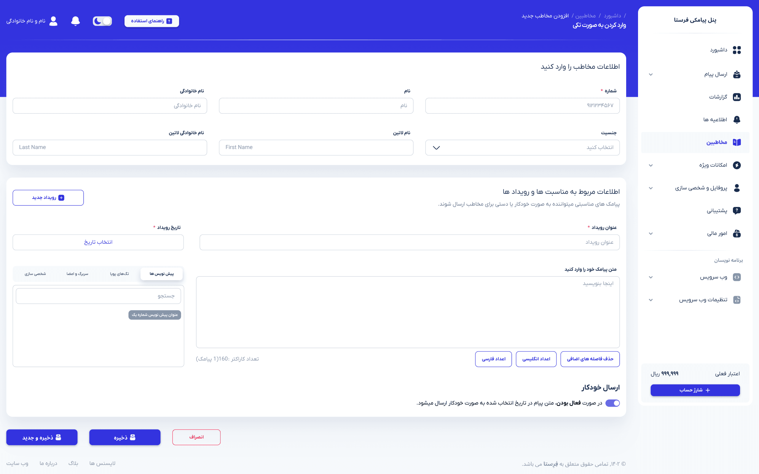

← drag to compare →
Understanding before designing
Before moving a single pixel, I mapped where friction actually lived across the business and user experience. No assumptions — only evidence.

Building a product-first acquisition ecosystem
The original website functioned primarily as a company brochure. Product communication lacked clarity, landing experiences were fragmented, and visitors struggled to understand what each service actually solved.
Product positioning
Shifting communication toward product-first value delivery.
Landing page strategy
Dedicated acquisition flows for separate services.
Information architecture
Simplifying structure and improving discoverability.
Conversion optimization
Reducing friction before activation.
Scalable system
Reusable patterns built for future growth.
Visual consistency
Unified design language across all surfaces.

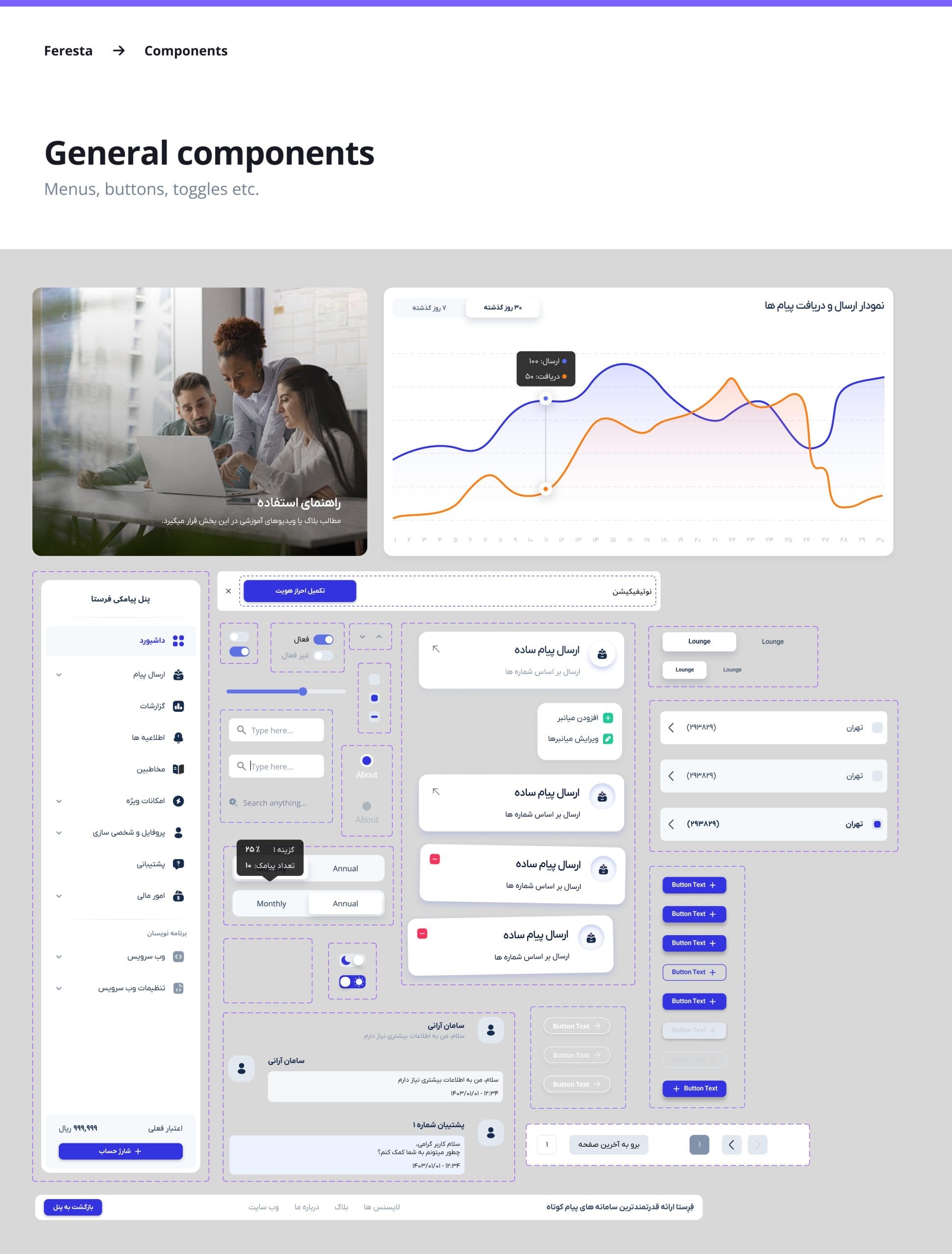
A foundation built to scale
Because the product was continuously growing, scalability was a core constraint from day one — not an afterthought. The design system let the team ship new surfaces without reinventing patterns.
Designed and built to remove a real bottleneck
After users purchased SMS services, connecting to WordPress required configuring complex API settings manually. For most customers, this meant opening a support ticket.
We designed and shipped a dedicated WordPress plugin. Install it, enter credentials — done. The system handles the rest, turning a multi-step technical process into a one-minute setup.
Improvements across every layer
The redesign improved usability, reduced operational friction, and created a scalable product foundation across both product and marketing experiences.